Showing posts with label Makings. Show all posts

Tuesday, January 24, 2012

Experiment: paint chips, paint stix, inks and embossing plates

Just recently a friend of mine from Split Coast Stampers (Misstreez) had been using her Shiva Paintstiks and had wondered whether they could be used for stamping.  I have wondered this myself on a few occasions.  So yesterday I finally took out my Paintstiks for a bit of a mess around.  I haven't had them out for a while, so they were all dry and needed to be peeled.

For those of you who don't know, Shiva Paintstiks are like long fat crayons but are made of paint without much oil.  They are mostly used for rubbings for fabric and used in quilting.  The company that makes them has a website here.  This is what three of mine look like:
(They are about 12cm long)

(Photos can be clicked on for a larger view)

So to find out whether or not they could be stamped with, I took a brown one (not shown ) and scrapped a little onto a non stick surface and added a few drops of oil.  I used a wooden skewer to mix it.  It was thick and lumpy and even after a while of both stirring and leaving it sit to dissolved - it just stayed fairly thick.  More oil just made it more of the same and oily.  So really for stamping it was not very good -


You can see from the picture - the brown flower is the Paintstik stamped onto ordinary cardstock and the pink flower is the stamp with normal stamping ink and embossing powder.  Just too lumpy to be really effective as a stamping medium.  If I really want to stamp with paint, I can use my acrylic paints (which are better with foam stamps than rubber stamps) or just buy ordinary oil paint and go from there.

Now I have to say, this is not to denigrate Paintstiks in anyway, it is just that from this little experiment, I feel they are not useful for stamping.

So while I had them out, I thought about some earlier experiments I had done, by rubbing a Paintstik on the surface of an embossing plate and then putting cardstock onto it and running it through my Bigshot dye cutter and dry embosser.  Lately I have been collecting paintchips just for the heck of it, and playing with them.  So I lay one of the chips on a suitable coloured up embossing plate and look:


I love the effects - this one using a sort of cobblestone plate.  The pink being the Painstik colour and the lighter part being the paint chip.  The lighter part is indented.  I did a couple more because it is hard to wash off and so wanted a few more for some scrapbooking I will be doing later.

So because it is so difficult to clean off the embossing plates, I thought if I dry emboss and apply the stick after, what would happen?  This:


This was achieved by putting in the paintchips one up and one down and running through the Bigshot.  Then getting the paint stick and lightly running it over the ridges of the indentations.  This will make a nice fish or mermaid tail...

Hmm, so I thought dark on light is nothing unusual, but when using stamping ink, if you want light on dark, stamping ink doesn't work all that well, and you are better off using coloured embossing powder and Versamark/watermark ink.

So I grabbed a dark paint chip and whizzed it through, and hmmm....


So I think that the raindrops are a bit too far apart for this to be conclusive.  But I think both cases make the raindrops look dimensional which is a good thing.  It is a thing I will have to play around with a bit more.

Well, so then I thought I would play around with dry embossing the paint chips and patting over with inkpads.

Well the one thing I know about this, is that if you want the ink to sit only on the top of the thing and not down in the indentations - that means a fabric pad has to be used and not a sponge pad.  This is a bit disappointing to me because I love my sponge pads.  Nevertheless, it was a chance for me to re-acquaint myself with my Stampin'Up! inks and play with my few Distress Inks.


I have 20 assorted colours of the Stampin'Up! pads but only five of the Distress ink pads at the moment, so my colours for them were pretty limited.  the distress ink doesn't really sit well on the paint chips:


I heat dried these and the colour is blotchy.  I still like them, and they will end up on a scrapbook page...

But okay, my favourite pink is the SU! Pixie Pink and I had to use some.....


The colour is not very good in these photos; but the effect is quite nice.  I am sure I have some baby pics of one of my grand daughters that will benefit from these...

And one last crossover -


Okay, this is a paintchip that has been dry embossed, coloured over with a Painstik, then dunked into my clear embossing powder and heat embossed.  Where the other Paintstik chips are going to take a few days to dry - mostly because of the humid and wet weather, this is dry already, and shiny and lovely.  Of all the techniques I experimented with, I think I love this one the most.

Conclusions: In all I did 18 samples and I thought:  I should be doing more of this stuff, it is fun and has some good applications for both cardmaking and scrapbooking.  I should also be doing it on a larger scale than just paint chips.  These will all be used, as that is what I made them for, but I will be doing smaller samples for the technique journal I am keeping...

Sunday, January 9, 2011

Updating


Gosh, I hadn't realised it was so long since I had updated this site. So sorry. I thought that you might enjoy seeing a few things - first up being my bigshot. In my last post I had said that I didn't really feel I could justify the expense of having one of these. Little realising at the time that just before Christmas Lincraft would have them so cheaply it would impossible not to get one. Normally these retail above the $150 mark and hover around $200 but this one was on special for $99. I thought it would just be the body itself and not really worth it, but it included all the folders and two acrylic blocks for the sandwiches that are made for cutting and embossing.

Because of the width of this machine, I can use my embossing folders which up until now have been pretty useless because of their width. Now I can use them on appropriately sized paper and cardstock. I have three dies now as well, a flower, some leaves and a corner swirl. The dies themselves are relatively expensive, but if I get enough use of them, can probaby justify the expense. Tim Holtz has some dies and embossing folders that are, what seem to me to be, reasonably priced and hopefully I can get some from a Queensland retailer in the next couple of months. No holding any breath.

This is a photo that I recently scrapbooked - she is my cousin's daughter. The wedding was last year and she posted pictures to Facebook. I had been wanting to do it for a while and finally got around. This is one of what will hopefully end up being ten pages. I want to make a 12" x 12" album in the same way I made the last one, but with white wedding dress fabric that I have. When those are finished I will post them here too.

I have some medical issues to be taken care of over the next few weeks so maybe not post again for a while. Once those are out of the way, I will show you some other things I have been doing and talk more about the above photograph.

Leaving final word up to Starbug

Talk to the butt ...

Wednesday, July 28, 2010

Common ...

I am on a few forums and groups that are for cardmaking. Mostly because they also have some scrapbooking forums and stamp stuff. They all have galleries where people can post pictures of the things they make. There is some really lovely stuff out there.

But so much of it looks as though it was made to a formula and had premade bits just glued to it. With the sketches that people offer, the dies and punches they use, basically it is made to a formula. Admittedly a handmade item, but a formula non the less. To me this is manufacturing and I am guilty of using it as the next person. Except for one thing. To me there has to be that edge of chaos somewhere. Where you expect a straight line, there is a ripped line; where you expect pearls or brads there are eyelets with string dangling from it. I cannot stand my work to look completely manufactured.

A couple of years ago when I was talking to my sister about making cards for Christmas and renewing our interest in scrapbooking, she made a comment along the lines of she wouldn't invest in stamps because they are like colouring book pages for adults. I had thought the same thing myself years ago. And stamps sure are the stallwart art of the manufacturer type card makers. And their Copic markers. Colour in the stamp with the Copic marker and no one can tell it isn't a real flower, right?

It may sound critical, but seriously card making should be individualised and a bit artistic. Rip up paper, use bottle caps and washers. Don't make your cards look like everyone else's. Since there are several million of that stamp anyhow. Don't follow fashion. You take pride in dressing as you like, having your house as you like, why should your card making be any different?

Take the stuff you have been taught by good teachers and expand on it. I love to get my embossing powders onto a washer, mixing colours and textures and then drizzle stuff into them.
Experiment. You don't have to sell/give away your experiments. Put them into a folder to remember what you did that you loved or hated. Be daring. Get out your brayer and give it a good workout, rip up some Post-its and do some masking. Look for stamps that come from little known manufacturers that no one else you know has heard of. Use their stamps.

The thing that also amuses me is the die mentality. All those shapes. For what? So your work looks the same as your neighbours? You like her stuff, borrow it and expand on it.

One thing I love is my Bind it All, yeah the pink one. I like to punch the holes into things and then tie some of it together and use maybe one wire spine on it somewhere to make it look different. Go and buy some real locks and keys and use them to make something useful, very useful. Make polymer clay feet so your box has something to stand on, or use those dice bits for feet.

People will love your work even more if they see some evidence of YOU in your work.


Monday, July 26, 2010

The making of an album ...


Earlier this year, my elderly father moved from Adelaide to Canberra, to be nearer to family. He has the family albums, so my Aunt, who remains in Adelaide did not have access to them any longer. As part of my "therapy" to overcome the major depression I had, my psychologist suggested that I take up a few projects. So I thought an album for my Aunt with pictures of my self, my two sisters and our respective families and grandchildren would be nice for her.

Above is the Cover of the album I made for her. I made if from a single fat quarter of fabric as the album is for 22cm x 22cm (8" x 8") pages. It is not overly large. The flower was originally a white fabric flower which I have coloured using my Versacolour mini and the red spots using Red Stazon after the yellow ink has dried.

I used a grommet (eyelet) in one corner (with my u-beaut cropadile) and threaded through for the tags. I like the effect without it being over arty farty.

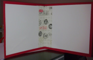
For the inside cover I have used a neutral cardstock, bookmaker's glue and all on a base of archival quality chipboard.


This is the side view to show you how 43 pages of scramping look. It took almost six weeks to complete. I have used "Wonder under" on the spine and ironed it to a same size piece of calico. This will give it expansion and make it last so much longer than a cardstock or paper one if you purchased a commercial album this size.

I will share some of the photos from the album to give you a feel for how the work was done and some of the detail that has gone into each page and it's opposite journal page.

ARTIST TRADING CARD:


This is the page of The Daughter and Grandsons 1 & 2. I wanted a sort of ATC feel to it. I printed off Lorum Ipsum in fancy but very tiny font, then applied four shades of brown ink around the edges with the Versacolor ink minis and then a final hop around with the black one. I have used a yin yang stamp for the circular drops attached to brown ribbon. The Eiffel tower was stamped and embossed. I cut round the top of the tower to slot in the photo behind it.

A few other stamps, were used to add a bit of abstract feel to it. I printed off the words onto some scrap cardstock and ran them through the Xyron sticker machine. There are a row of gold brads down the RH corner and along the bottom which were cut off in the photo.

The page opposite this one is rather a scaled down version, and instead of the picture I have journalled about the photograph and the people in it.

LIZARD LOVE:

Grandson2 loves lizards, so it was only natural I did a page that had lizards on it. But putting it into perspective with the picture wasn't all that easy. This photograph makes it look as though there are several kinds of lavender but in fact the matt stock is bright pink - his favourite colour at the moment (don't ask - he wont say). Unlike most of the other pages for the journalling where I have made them just either the same as each other or reflection of each other, I have made this one a continuation picture.

I tore a sheet of printer paper to make the shape of the creek for the lizards, and using my Versacolor mini stamp pads applied various greens, then blues and brown and green again for the banks and creek. I then used blender pens (SU!) to blend the colours. I stamped on the dragonflies. Then used the white gel pen for the waves on the water. I used the thin end of double brush marker pens to make the grass. for the weeds I used a skinny plant stamp.

The trees in the back ground were stamped in green, then used a maroon pen to colour the trunks and branches. The lizards I had downloaded onto cardstock several years ago. I just cut them out and using foam dots to raise them made them look like they were drinking at the stream.
Below is a closer look at each side of the picture.


HER MAJESTY THE QUEEN OF SHEBA

This last page is for my Arabian mare, Stephanique. She is a dear old horse and I wanted somthing fitting for "the Queen of Sheba" (lol).
I used a background egyptian themed stamp I have had for a few years with Versamark. I stamped the versamark onto the page, then sprinkled clear embossing powder over it. Tapped it off and heat embossed it. I had to use the stamp four times around the page to cover it.
I then used the Versamark again for the Eye of Ra and the Ankh, then sprinkled on some hologram gold embossing powder. When heated, the hologram gold is really sparkly and looks like real gold. The three little date palms were stamped in back ink and clear powder used on them. One didn't take so well so I fixed it with a black marker. Shhh ...
So the entire album has gone along in this manner, using colours from the phot0graphs. Stamps and use of brads, stick on crystals, punches and so forth.
My Aunt was pretty happy with the album, so that made me extremely happy.


Wednesday, September 16, 2009

Enter a dragon ...


I received some new stamps this week that I had ordered from the USA. The dragon was one and the Asian writing was another. They are unmounted. The writing was on a sheet with two other blocks of writing - one old English and the other handwriting. They are considered background stamps. I couldn't resist putting the Asian writing with the dragon and adhering it all to a background sheet downloaded from the Canon website. Four gold brads just seem to set it off. The dragon is stamped in Versamark onto red cardstock and then holographic gold embossing powder melted onto the versamark.

I have been wanting to make my father a nice card that was not the usual "Thinking of you" flowers or other usuals of these types of cards. I think this fulfills my desire perfectly. Here is the inside. If I wanted to, I could add a few pages as everyone wants to send a message to Granpa.


the card measures 14.5cm square.

I apologise for the quality of the photos. I took them on my phone camera. Usually it is a pretty reliable instrument but I think the lens must need a good cleaning.

Sunday, May 25, 2008

Star Book ...

I love making books. Books that are glued or books that are sewn or books that are a combination of both. I also like folded books, such as a maze book or concertina book. Today I am going to show you my Star Book.


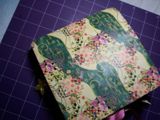
Okay, this is the cover. The paper was downloaded from the Canon site and was just so pretty.

The handsewn spine. I just used crochet cotton; but I used a cradle to mark all the holes. I have seen these made with a Zutter punch and wire spine, but it didn't look as good as the effect you get from handsewing.


The first open pages. The picture on the blue square is a gold stamp image.


Here I have cut out a frame on the left hand side and inserted a photograph. On the right hand are two tiny frames that have floral stickers to add a little focus. (Sorry the camera strap dropped down).


This is the tiled page stamped with my dragonfly art stamp and embossed. Opposite is an acrylic pocket with a tag. The tag top has beads and embellishments tied to it.


This is the last page. The tied thing on the back cover is a mini book. It has pages, but nothing in it just yet. I still have one or two small things to do to the book.

I think everyone should try at least one. This was the second one I made. The only problem I have had with it, is that the glue between the pages doesn't hold too well. It is quite heavy and I think this may be the cause. I will keep experimenting.

adieu ...