Saturday, July 31, 2010

Disappointed ...

Well, off I went with the daughter and two grandsons to MacArthur Square, Campbelltown. They say that from Big W to the Food Court at the other end is one kilometer exactly. I don't know how true this is, but when so many people say it there has to be some element of truth. It feels about that distance, except when you are tired or busting ...

I had hoped to be able to purchase two punches and refills for my Xyron sticker machines - in permanent stick (as oppossed to repositionable). In the past Big W has been a reliable and less expensive venue to purchase these items. Only to be disappointed. Their scrapbook aisle has gone from three down to part of one. I checked the whole stationery section, only to find nothing of what I was looking for.

So the next choice, Lincraft, is right down the opposite end of the building. I haven't been the best with an enlarged colon (waiting to see specialist) and the pressure makes me walk funny. The thought of walking an entire kilometer was pretty daunting. So I grabbed a trolley to lean on and made my way to some personal purchases in Best and Less, trust me, when you are a large odd shape and size, B&L are the best at good prices.

Finally after about half an hour, I made it to Lincraft. Surely, they would have everything I needed. I found one of the punches I required, and while they did have refills for the Xyron machines, they only had repositionable. I have about two each of repositionable already.

I sat down and ate some food, had a drink and a chat with the daughter. She and the boys loaded up my trolley with their goodies. My only other recourse would have to be Eckersleys.

The lift with a trolley is a nightmare. Glad I don't have kids in pushers anymore. But Eckersleys is one of my favourite shops for buying unusual craft supplies. They are pretty well my stalwarts for everything - but a tad (well more than a tad really) expensive. Still, I had the money and the desperation in I went. WTF? Where is everything? You have so got to be kidding me. Not a bleeding sausage. Whoever decided to overhaul their paper craft section must have been on drugs or something. Well, that is the mood I am in just now on how I feel about it all. No second punch, so I have ordered it off the internet. Not one of the refills I wanted - even in repositionable.

Luckily Spotlight have a sale on at the moment, and I have to go to the Spotlight Mall tomorrow to get my sewing machine from being serviced. Please let Spotlight have the refills. Is it really too much to ask?

Wednesday, July 28, 2010

Common ...

I am on a few forums and groups that are for cardmaking. Mostly because they also have some scrapbooking forums and stamp stuff. They all have galleries where people can post pictures of the things they make. There is some really lovely stuff out there.

But so much of it looks as though it was made to a formula and had premade bits just glued to it. With the sketches that people offer, the dies and punches they use, basically it is made to a formula. Admittedly a handmade item, but a formula non the less. To me this is manufacturing and I am guilty of using it as the next person. Except for one thing. To me there has to be that edge of chaos somewhere. Where you expect a straight line, there is a ripped line; where you expect pearls or brads there are eyelets with string dangling from it. I cannot stand my work to look completely manufactured.

A couple of years ago when I was talking to my sister about making cards for Christmas and renewing our interest in scrapbooking, she made a comment along the lines of she wouldn't invest in stamps because they are like colouring book pages for adults. I had thought the same thing myself years ago. And stamps sure are the stallwart art of the manufacturer type card makers. And their Copic markers. Colour in the stamp with the Copic marker and no one can tell it isn't a real flower, right?

It may sound critical, but seriously card making should be individualised and a bit artistic. Rip up paper, use bottle caps and washers. Don't make your cards look like everyone else's. Since there are several million of that stamp anyhow. Don't follow fashion. You take pride in dressing as you like, having your house as you like, why should your card making be any different?

Take the stuff you have been taught by good teachers and expand on it. I love to get my embossing powders onto a washer, mixing colours and textures and then drizzle stuff into them.
Experiment. You don't have to sell/give away your experiments. Put them into a folder to remember what you did that you loved or hated. Be daring. Get out your brayer and give it a good workout, rip up some Post-its and do some masking. Look for stamps that come from little known manufacturers that no one else you know has heard of. Use their stamps.

The thing that also amuses me is the die mentality. All those shapes. For what? So your work looks the same as your neighbours? You like her stuff, borrow it and expand on it.

One thing I love is my Bind it All, yeah the pink one. I like to punch the holes into things and then tie some of it together and use maybe one wire spine on it somewhere to make it look different. Go and buy some real locks and keys and use them to make something useful, very useful. Make polymer clay feet so your box has something to stand on, or use those dice bits for feet.

People will love your work even more if they see some evidence of YOU in your work.


Monday, July 26, 2010

The making of an album ...


Earlier this year, my elderly father moved from Adelaide to Canberra, to be nearer to family. He has the family albums, so my Aunt, who remains in Adelaide did not have access to them any longer. As part of my "therapy" to overcome the major depression I had, my psychologist suggested that I take up a few projects. So I thought an album for my Aunt with pictures of my self, my two sisters and our respective families and grandchildren would be nice for her.

Above is the Cover of the album I made for her. I made if from a single fat quarter of fabric as the album is for 22cm x 22cm (8" x 8") pages. It is not overly large. The flower was originally a white fabric flower which I have coloured using my Versacolour mini and the red spots using Red Stazon after the yellow ink has dried.

I used a grommet (eyelet) in one corner (with my u-beaut cropadile) and threaded through for the tags. I like the effect without it being over arty farty.

For the inside cover I have used a neutral cardstock, bookmaker's glue and all on a base of archival quality chipboard.


This is the side view to show you how 43 pages of scramping look. It took almost six weeks to complete. I have used "Wonder under" on the spine and ironed it to a same size piece of calico. This will give it expansion and make it last so much longer than a cardstock or paper one if you purchased a commercial album this size.

I will share some of the photos from the album to give you a feel for how the work was done and some of the detail that has gone into each page and it's opposite journal page.

ARTIST TRADING CARD:


This is the page of The Daughter and Grandsons 1 & 2. I wanted a sort of ATC feel to it. I printed off Lorum Ipsum in fancy but very tiny font, then applied four shades of brown ink around the edges with the Versacolor ink minis and then a final hop around with the black one. I have used a yin yang stamp for the circular drops attached to brown ribbon. The Eiffel tower was stamped and embossed. I cut round the top of the tower to slot in the photo behind it.

A few other stamps, were used to add a bit of abstract feel to it. I printed off the words onto some scrap cardstock and ran them through the Xyron sticker machine. There are a row of gold brads down the RH corner and along the bottom which were cut off in the photo.

The page opposite this one is rather a scaled down version, and instead of the picture I have journalled about the photograph and the people in it.
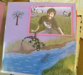
LIZARD LOVE:

Grandson2 loves lizards, so it was only natural I did a page that had lizards on it. But putting it into perspective with the picture wasn't all that easy. This photograph makes it look as though there are several kinds of lavender but in fact the matt stock is bright pink - his favourite colour at the moment (don't ask - he wont say). Unlike most of the other pages for the journalling where I have made them just either the same as each other or reflection of each other, I have made this one a continuation picture.

I tore a sheet of printer paper to make the shape of the creek for the lizards, and using my Versacolor mini stamp pads applied various greens, then blues and brown and green again for the banks and creek. I then used blender pens (SU!) to blend the colours. I stamped on the dragonflies. Then used the white gel pen for the waves on the water. I used the thin end of double brush marker pens to make the grass. for the weeds I used a skinny plant stamp.

The trees in the back ground were stamped in green, then used a maroon pen to colour the trunks and branches. The lizards I had downloaded onto cardstock several years ago. I just cut them out and using foam dots to raise them made them look like they were drinking at the stream.
Below is a closer look at each side of the picture.


HER MAJESTY THE QUEEN OF SHEBA

This last page is for my Arabian mare, Stephanique. She is a dear old horse and I wanted somthing fitting for "the Queen of Sheba" (lol).
I used a background egyptian themed stamp I have had for a few years with Versamark. I stamped the versamark onto the page, then sprinkled clear embossing powder over it. Tapped it off and heat embossed it. I had to use the stamp four times around the page to cover it.
I then used the Versamark again for the Eye of Ra and the Ankh, then sprinkled on some hologram gold embossing powder. When heated, the hologram gold is really sparkly and looks like real gold. The three little date palms were stamped in back ink and clear powder used on them. One didn't take so well so I fixed it with a black marker. Shhh ...
So the entire album has gone along in this manner, using colours from the phot0graphs. Stamps and use of brads, stick on crystals, punches and so forth.
My Aunt was pretty happy with the album, so that made me extremely happy.